

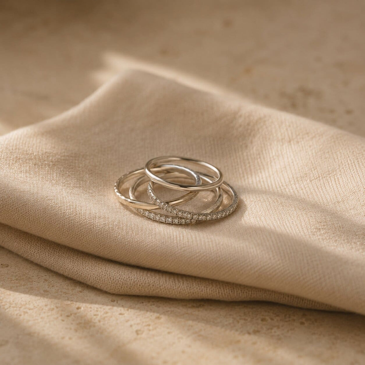
Old Money Aesthetic Rings: Quiet Luxury Pieces That Don't Shout the Price
The old money aesthetic isn't about spending more. It's about spending quietly — choosing pieces that read as considered rather than announced, so the person wearing them looks like they've simply always had good things. Applied to a ring, that idea is surprisingly specific: it's less about carat size and more about restraint, proportion, and a handful of small details that signal craftsmanship instead of cost.
None of it requires a bigger budget. It requires knowing which details actually read as "quiet" and which ones read as "loud" — and choosing accordingly.


What "old money" actually means on a ring
The term gets used loosely, but on jewelry it has a fairly consistent meaning: pieces that look inherited rather than purchased yesterday. That impression comes from a specific set of choices — a single, well-proportioned stone rather than a cluster of competing ones; a tonal metal finish rather than a mix that draws the eye around the hand; settings that protect the stone rather than lift it up for maximum visibility. None of this is about size. A large stone in a quiet setting still reads as considered. A small stone in a loud setting can read as trying too hard.
It's also, notably, not about logos, engraving, or anything that announces a brand. The entire premise of quiet luxury is that the details reward a closer look rather than a first glance — which is exactly why it translates so well to a ring that's meant to be worn daily rather than shown off once.
The details that read as quiet — and the ones that read as loud
A few structural choices do most of the work here. Milgrain edging — the tiny beaded detailing along the edge of a band — is one of the clearest "quiet luxury" signals in ring design, because it reads as old-world craftsmanship rather than modern sparkle. It's subtle enough that most people register it as "this looks well made" without being able to say exactly why.

The Beatrice Ring
A round-cut center stone set on an intricate milgrain bezel band — the beaded detailing that reads as old-world artisan work rather than modern sparkle. It's the kind of ring that photographs quietly and wears even more quietly.
Shop The Beatrice Ring →Proportion matters just as much as detail. A stone that's sized sensibly for the hand wearing it, set low enough that it doesn't catch on everything, tends to read as more established than a stone chosen purely to maximize size. This is one of the reasons low-profile settings have become such a fixture of the quiet luxury look — they prioritize wearability and restraint over spectacle, which is precisely the impression the aesthetic is built on.
Metal choice tells its own story too. A single, consistent tone across the ring — rather than a mash-up of white, yellow, and rose in one piece — reads as deliberate. It suggests the piece was chosen to match an existing collection rather than picked as a standalone statement.
Why bezel and channel settings read differently than dramatic prongs
Setting style might be the single biggest lever here. A tall, four-prong setting is designed to lift a stone up and let light hit it from every angle — beautiful, but unmistakably built to be noticed. A bezel setting does almost the opposite: it wraps a thin wall of metal around the stone's edge, holding it flush and secure, low to the hand. The stone still catches light, but it does so quietly, without demanding attention the way a raised prong setting does.
Channel-set stones follow the same logic in a different form — instead of individual prongs, the stones sit recessed between two rails of metal, flush with the band's surface.

The Devotion Ring
A continuous circle of baguette-cut stones set in a sleek channel design — geometric, architectural, and set flush rather than raised. It's sparkle with structure, which is exactly the restraint the quiet luxury look is built on.
Shop The Devotion Ring →Both settings also happen to be more practical for daily wear — fewer edges to snag, less metal standing proud of the band — which is a large part of why they've become so closely associated with an aesthetic that's fundamentally about looking effortless rather than engineered for attention.
| Detail | Reads as "loud" | Reads as "quiet luxury" |
|---|---|---|
| Setting | Tall prongs, maximum lift | Bezel or channel, flush to the band |
| Metal | Mixed tones on one ring | Single, consistent tone |
| Edging | Plain, unadorned | Milgrain or beaded detail |
| Stone count | Many competing accents | One clear focal point |
| Overall impression | Built to be noticed | Built to be worn |
Worth knowing: A well-cut stone in a low, secure setting can look larger and more expensive than a bigger stone in a shallow, poorly proportioned one. Cut quality and setting height do more visual work than sheer size — which is exactly why pavé detailing has such an outsized effect on how expensive a ring looks relative to what it actually costs.
Building the look without changing the budget
The quiet luxury aesthetic happens to be one of the easiest looks to build affordably, because so much of it depends on restraint rather than expense. A single tonal metal, a secure low-profile setting, and one well-proportioned stone will read as considered regardless of what the piece is actually made of. In simulated diamond and sterling silver, that same formula produces a ring that looks exactly as intentional as one that cost ten times more — the kind of thing worth understanding before you shop by what your money actually buys at each price point.
Stacking follows the same rule. Two or three thin, tonal bands worn together read as a considered collection. Four or five competing widths, finishes, and stone sizes read as an accumulation. If you're building toward a stack rather than buying one piece, the same restraint that makes a single ring look quiet also makes a group of rings look like they were chosen together on purpose.
✦ Pro tip: If you're unsure whether a piece leans "quiet" or "loud," photograph it from a few feet away. Quiet luxury pieces still look composed and deliberate from a distance — it's only up close that the detail reveals itself.
Where the look tends to go wrong
The most common mistake isn't choosing the wrong ring — it's over-explaining it. A single well-chosen piece worn with quiet confidence does more for the aesthetic than several "quiet luxury" pieces worn all at once, each one competing to prove the point. Restraint has to extend to quantity, not just style; three understated rings stacked together can still look busy if none of them were chosen with the others in mind.
The other common misstep is treating "quiet" as synonymous with "boring." A milgrain edge, a crossover pavé band, or an architectural baguette channel all have real presence — they simply express it through detail and craftsmanship rather than scale. The goal isn't to disappear. It's to make the sparkle feel earned rather than announced.
Quick Takeaways
- Old money aesthetics are about restraint and proportion, not carat size or price.
- Milgrain edging and low-profile settings read as old-world craftsmanship rather than modern sparkle.
- Bezel and channel settings sit flush and quiet, unlike tall prong settings built to be noticed.
- A single, consistent metal tone reads as far more considered than mixing several in one piece.
- The look depends on choices, not budget — which makes it one of the most accessible aesthetics to build well.
Frequently asked questions
Does "old money" jewelry have to be vintage or antique?
No. The aesthetic borrows details associated with heirloom pieces — milgrain, bezel settings, tonal metals — but they're widely available in current designs. What matters is the detail, not the age of the piece.
Is a bigger stone ever part of the old money look?
Yes, as long as it's set with restraint. A larger stone in a low, secure setting with a single metal tone still reads as considered. It's the setting and proportion that signal "quiet," not the stone size itself.
Why do bezel settings feel more "quiet luxury" than prong settings?
Bezel settings hold the stone flush and low, so it doesn't visually demand attention the way a raised, light-catching prong setting does. The stone still sparkles — it just does so more subtly.
Can I get this look without buying multiple new rings?
Often, yes. Simplifying an existing stack — removing pieces that compete rather than complement — does most of the work. The aesthetic is as much about editing as it is about buying.
Does mixing metals completely rule out the old money look?
Not entirely, but it does work against it. The look leans on visual consistency, so a single dominant tone across your rings will always read as more deliberate than a deliberate mix.
The quiet luxury aesthetic rewards patience over impulse — choosing the detail that holds up on a closer look rather than the one that catches the eye first. That's a standard any ring can meet, regardless of what it's made of, as long as the proportions and the setting are right.


